Blog · Regression ·
A Gaussian process is just a prior over functions (and here are its knobs)
Marginalise the basis functions away and the prior lands on the function itself. Four hyperparameters, four visibly different kinds of curve, including two that are not curves at all.
- interactive
- gaussian-process
- kernel-methods
- regression
- bayesian
- matlab
An earlier post ended on a complaint about my own machinery. Bayesian linear regression gives you a posterior over weights, a predictive band that widens where the data is thin, and an evidence that ranks models without a validation set, but all of it is exact only because the model is linear in , and that forced me to write down before I could start. I picked monomials. Then I spent a whole section using the evidence to choose how many monomials, which is a fine thing to do and completely silent on whether monomials were the right idea.
Two months later, for assignment 3 of the same module, I wrote a report whose Part A does the obvious thing on its first page: it marginalises away entirely. What is left is a prior over functions, and you never have to name a basis again.
Parametric, or keep the data
The report opens by splitting machine learning in two, and the split is the right frame for everything that follows. A parametric algorithm looks at the training data, tunes some parameters, and then you can throw the data away: the model alone makes predictions. A kernel method cannot throw the data away: it needs the training points at prediction time, every one of them. What you buy with that is a model that often needs less data and takes almost no time to train.
That is a real trade and it is worth stating in units. The order-9 polynomial is ten numbers, forever, whatever the size of the training set. A Gaussian process on points is points, plus the matrix you factorised, and if you double the factorisation costs eight times as much. In exchange, you never choose a basis.
From a prior on weights to a prior on functions
Start where the parametric story starts. Outputs are linear in the weights through a design matrix, report Eq. (3.1):
Put the same zero-mean isotropic Gaussian prior on the weights as before, Eq. (3.2):
Now the move. is a fixed linear map of a Gaussian, so is Gaussian, and you can write its distribution without ever mentioning again: Eq. (3.3):
Look at what survived. The covariance depends on the inputs only through , whose entry is , an inner product between two feature vectors, and nothing else. The individual coordinates of never appear. So replace the whole matrix with , where and is any function that returns the inner product two feature vectors would have had. That is the kernel trick, and stated this way it is not mystical: it is the observation that a term dropped out of the algebra, so you may as well stop computing it. You can now use a with infinitely many components, as long as the inner product has a closed form.
Observations are noisy, so the latent and the measured differ, Eq. (3.4):
Marginalise out of that and you get the whole model in one line, Eq. (3.5):
Two Gaussians and two marginalisations, and the basis is gone. Everything that is left to choose is .
The kernel is the model
The report’s Eq. (3.6) is the standard four-hyperparameter kernel:
and Eq. (3.7) is the same thing with a separate weight per input dimension inside the exponent, Automatic Relevance Determination, which is the next post’s subject and not this one’s:
The thing worth noticing about (3.6) is that it is a sum. Three separate covariance functions added together: a squared-exponential, a constant, and a dot product. Adding kernels is legal (a sum of positive semi-definite matrices is positive semi-definite) and the sum’s samples are the sum of independent samples from each part. So each term contributes its own kind of function to the prior, additively. That is easier to believe after you have watched it happen, which is the next section.
Draw the prior before you fit anything
Here is the sampler itself, the MATLAB function that draws the random curves, with the fourth and fifth draws and thirty lines of figure plumbing trimmed:
function plotRandFunctions( x, theta0, theta1, theta2, theta3, seeds )
    k = @(x0,x1,Theta0,Theta1,Theta2,Theta3) ...
        Theta0*exp(-(Theta1/2.0)*(x'-x).^2) ...
        + Theta2 + (Theta3*(x'*x));

    rng(seeds(1));
    y1 = mvnrnd(zeros(size(x)),k(x,x,theta0,theta1,theta2,theta3));
    rng(seeds(2));
    y2 = mvnrnd(zeros(size(x)),k(x,x,theta0,theta1,theta2,theta3));
    rng(seeds(3));
    y3 = mvnrnd(zeros(size(x)),k(x,x,theta0,theta1,theta2,theta3));
x is a row vector, so (x'-x).^2 is the matrix of squared differences and x'*x is
the outer product, Eq. (3.6) evaluated on a grid, in one anonymous function. Then five
draws from .
The rng(seeds(i)) before each draw is the part I would tell anyone to copy. The seeds
are fixed across parameter settings, so when you change and redraw, you are
not looking at five new functions: you are looking at the same five functions, morphed.
Every difference between two panels is caused by the parameter. Without that, comparing
two panels of random curves tells you almost nothing, and the effect of a hyperparameter
is buried under the variance of the sampler.
The script that drives it, calling it once per parameter setting, is a flat list:
close all
x = linspace(-1,1,1000);

seeds = randi([0 10000],1,5);
plotRandFunctions(x,1,4,0,0,seeds);
plotRandFunctions(x,1,0.25,0,0,seeds);
plotRandFunctions(x,9,4,0,0,seeds);
plotRandFunctions(x,1,4,10,0,seeds);
plotRandFunctions(x,1,64,0,0,seeds);
plotRandFunctions(x,1,4,0,5,seeds);
Seventeen calls in all, which became the eighteen panels of report Figs. 1–5. In the order the script above makes them, with the figure each one ended up in:
| # | Figure | ||||
|---|---|---|---|---|---|
| 1 | 1 | 4 | 0 | 0 | 5 |
| 2 | 1 | 0.25 | 0 | 0 | 5 |
| 3 | 9 | 4 | 0 | 0 | 5 |
| 4 | 1 | 4 | 10 | 0 | 5 |
| 5 | 1 | 64 | 0 | 0 | 5 |
| 6 | 1 | 4 | 0 | 5 | 5 |
| 7 | 0 | 0 | 1 | 0 | 3 |
| 8 | 0 | 0 | 10 | 0 | 3 |
| 9 | 0 | 0 | 100 | 0 | 3 |
| 10 | 0 | 0 | 0 | 1 | 4 |
| 11 | 0 | 0 | 0 | 10 | 4 |
| 12 | 0 | 0 | 0 | 100 | 4 |
| 13 | 1 | 0.1 | 0 | 0 | 2 |
| 14 | 1 | 1 | 0 | 0 | 2 |
| 15 | 1 | 10 | 0 | 0 | 2 and 1 |
| 16 | 10 | 10 | 0 | 0 | 1 |
| 17 | 100 | 10 | 0 | 0 | 1 |
Four knobs
The report’s §3.1 gives a paragraph of intuition per parameter. Rephrased, with what I found when I re-derived each claim numerically:
scales everything. It multiplies the squared-exponential term, so with it multiplies the whole of , and a draw scales by . Not “the curves get bigger”, the same curve, at a different zoom. Report Fig. 1 is three panels at and they are the same five wiggles with the y-axis relabelled; in my reimplementation the draws at match ten times the draws at to over 240 grid points, which is the Cholesky jitter and nothing else. The report puts it as ” is responsible for setting the magnitude of the functions around the mean”, and adds the observation that matters later: the variance as you move away from a known point also grows faster with a larger .
sets the length scale, so it sets the frequency. It divides the squared distance in the exponent, so a large makes the correlation between two nearby inputs decay quickly, and a function that decorrelates over a short distance is a function that wiggles. The report: low gives smoother graphs, and “it is possible to generate higher frequency graphs by increasing ”. Fig. 2 walks 0.1 → 1 → 10 and Fig. 5 has a panel that looks like noise.
Those two are the ones everybody expects. The other two are the reason this section of the report is worth reading.
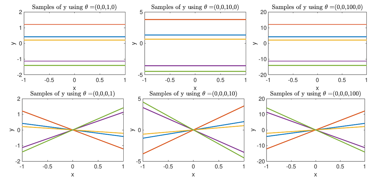
Report Figs. 3 and 4, the plot rows only. Top: alone, at 1, 10 and 100, five horizontal lines. Bottom: alone, at 1, 10 and 100, five straight lines through the origin. Same five seeds down each column.
is a constant added to every entry of , and a constant covariance means a constant function. If for every pair, then every pair of points is perfectly correlated: knowing at one input tells you everywhere. The draws are horizontal lines whose height is Gaussian with variance , flat to in my implementation, and to if you factorise the whole summed matrix the way the MATLAB does, which is the jitter showing. The report’s reading is that “controls how much the mean of the training samples should contribute to the output”, which is exactly right: it is a prior over the offset of the whole function.
is the dot product, and a dot-product covariance means a straight line. is a rank-one matrix, the outer product of the input vector with itself, so a draw is for one random slope with variance , a line through the origin, straight to the same (or through one Cholesky of the summed matrix). The report reads this as “increasing this parameter increases the likelihood of functions which increase or decrease linearly as increases”.
That is the moment the additive structure of (3.6) stops being a formula. The kernel is a sum of three terms and the prior is a sum of three families of function: an offset, a slope, and a wiggle. Turn two of them off and you can see the third on its own. Turn them all on (the and panels of Fig. 5) and you get a wiggle that has been given a random height, or a random tilt.
Turn the knobs yourself
Which is the whole argument for making this interactive rather than printing eighteen
panels. The five curves below are tied to five fixed vectors, exactly like
rng(seeds(i)): move a slider and the same five functions morph instead of re-rolling.
The preset buttons are the seventeen settings from the driver script above, verbatim,
grouped by the figure they became.
Things worth doing, in order:
- Press the three Fig. 3 presets. Five horizontal lines, three zoom levels, with the entire draw has collapsed to one random number per curve. Then the three Fig. 4 presets: five straight lines, every one of them through the origin, because a covariance of says the function has variance zero at and it cannot be anywhere else.
- Start from and drag up. The wiggles do not change shape; they slide apart vertically, because you are adding an independent random offset to each. Then reset and drag up: they tilt.
- Drag across its range and watch the kernel heatmap under the plot at the same time. The bright band around the diagonal narrows as the curves get busier. That band is the length scale.
- Click the plot to add observations (or press five observations for a scattered set). The prior becomes a posterior: the mean curve bends through your points, the band collapses at them and fans out between and beyond them, and the five sample functions become five functions that agree with your data and disagree everywhere else.
- Press eleven noisy samples, then “fit the knobs to the data”. A hundred and twenty finite-difference gradient steps on the log marginal likelihood, with the value reported before and after. Those eleven points are plus Gaussian noise of standard deviation 0.06, and the optimiser is told none of that.
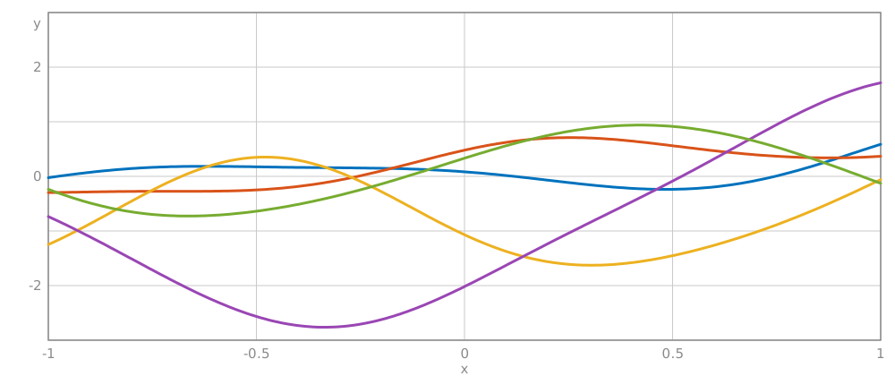
With JavaScript on this becomes a sandbox: four θ sliders plus a noise slider and a grid-size slider, preset buttons for the report’s seventeen settings, a canvas you can click to add observations (the samples become posterior samples and a ±2σ band appears), a live heatmap of the kernel matrix K, a button that fits the hyperparameters to your points by gradient ascent on the log marginal likelihood, and CSV export of the mean and band. The static figure is five draws from the prior at θ = (1, 4, 0, 0), drawn by the same code.
Conditioning, which is where regression comes from
Everything above is the prior, no data has been seen. Regression is one more Gaussian identity. The report stops at “it is now possible to perform regression by evaluating ” and hands the rest to the GPML toolbox, so the two formulae the widget actually runs are Bishop’s, 6.66 and 6.67. Write for the vector of kernel evaluations between the new input and each training input, and :
Read the mean formula slowly, because it is the trade from the first section written out. is a vector of numbers computed once; the prediction is those numbers dotted with the kernel evaluated between the new point and every training point. The model is the training set. Throw the data away and you have nothing to evaluate against.
And the variance: it starts at the prior variance and subtracts a non-negative quadratic form. Data can only ever reduce it. The subtracted term is large where points along directions the data has pinned down and small where it does not, so the band closes at the observations and opens between them, the same shape as the predictive band of the parametric model, arrived at without choosing a basis.
The one place the cubic bites
Sampling from a GP prior on a grid of points means factorising an matrix.
The MATLAB sampler runs on linspace(-1,1,1000), which is a
Cholesky: MATLAB does not blink, and the report never mentions it. In hand-written
JavaScript it is a different conversation. Timing my own factorisation in Node:
| time | ||
|---|---|---|
| 100 | 0.17 Mflop | 0.44 ms |
| 240 | 2.3 Mflop | 5.4 ms |
| 500 | 20.8 Mflop | 53 ms |
| 1000 | 167 Mflop | 422 ms |
Double the points and you do eight times the work, and it is measured, not asserted: 240 → 500 is 2.08× the points, 9.0× the flops and 9.9× the time. So the widget defaults to , which redraws comfortably inside a frame, and gives you the grid size as a slider up to 500 with a live “chol … ms” readout, because feeling a slider get sticky is a better lesson about than reading the exponent. The report’s 1000 points would be about 0.4 s per redraw, fine for printing six figures to PDF, hopeless for dragging a slider.
Two numerical notes on getting there. First, is singular for most of the
interesting presets: alone gives a matrix of identical entries, alone
gives a rank-one outer product, and gives all zeros. A plain Cholesky fails on
every one of them. The fix is jitter: add times the mean diagonal to the
diagonal before factorising, and escalate by hundreds if it still fails. The
-sized deviations from perfectly flat lines I quoted above are that jitter, made
visible, sampling the three terms separately sidesteps two of the three singular cases
entirely, which is a second reason to do it. Second, MATLAB’s mvnrnd does not use a Cholesky on a singular covariance; it
falls back to an eigendecomposition (cholcov). So my curves are not numerically the
report’s curves even for the same seeds: they are draws from the same distribution, made
with the same discipline.
What this bought, and what it did not
The basis is gone. I never wrote down , never chose a polynomial order, and never ran a model-comparison sweep, and I still have a mean function and error bars that mean what they say. What replaced the order is , and they are not the same kind of choice: is a discrete decision between models, while the s are continuous, differentiable, and can be optimised against the log marginal likelihood, which is what the “fit the knobs” button does, and what the whole of the report’s §3.2 does properly with ten random restarts.
Which raises the question the next post is about. If you can learn the length scale, and you give each input dimension its own, then the model can decide for itself which of your inputs matter. Bolt two columns of pure noise onto a four-dimensional problem and watch it find them.