Blog · Features and preprocessing ·
Look-up tables: log, gamma, contrast stretching, bit planes, equalisation
Five image-enhancement transforms turn out to be the same object, a 256-entry array, built five different ways. Histogram equalisation builds that array from the image itself, and CLAHE is where one array stops being enough. An interactive lab, with a live Rust/WASM CLAHE against the report’s own hidden test pattern.
- interactive
- image-processing
- histogram-equalization
- clahe
- gamma-correction
- look-up-tables
- opencv
- rust
- wasm
Section 4 of the report is called “Intensity Transforms”, and by the end of it I had
written five functions that all have the same shape. Each one looks at a single pixel,
ignores every other pixel in the image, and returns a new value. Fed the same input twice
it returns the same output twice. Which means every one of these “transforms” is really
just a function from {0, 1, ..., 255} to {0, 1, ..., 255}: 256 numbers in, 256 numbers
out, and instead of recomputing the formula for every pixel in a megapixel image, you
compute it once for each of the 256 possible inputs, store the 256 answers in an array, and
then every pixel becomes one array lookup. That array is a look-up table, LUT for short,
and it is one of the cheapest tricks in this entire report: build 256 numbers, and a
million-pixel image processes in a single pass with no per-pixel arithmetic at all.
Five of this post’s six transforms are exactly that. The sixth, histogram equalisation, is still a LUT, just one the image builds for itself instead of one you tune by hand. And right at the end there’s CLAHE, the one technique in the chapter that genuinely cannot be reduced to a single 256-entry array, because the “right” transform for a pixel now depends on where it is, not just what value it holds. That’s where this post, and the widget underneath it, both stop being able to cheat.
Eq. 4.1 is the report’s way of saying all of this in one line:
for any function applied pixel-by-pixel. Everything below is a different choice of .
Log: seeing the invisible dynamic range
The first transform stretches values near zero across a huge output range:
Here’s the function that builds it:
def log_transform(src, c, prescale=1.0, base=np.e):
    out = c*np.log(1.0+src/prescale)/np.log(base)
    #return cv2.convertScaleAbs(out)
    return out
The +1 matters: log(0) is undefined, and a lot of the images this gets used on (DFT
magnitude spectra, mainly) have plenty of zeros. The report’s real use case is exactly
that. A 2D Fourier transform’s magnitude spectrum is dominated by one enormous DC spike at
the centre and a sea of values that are, by comparison, indistinguishable from zero. Cast
directly to 8-bit and displayed, you see one white dot on a black square and nothing else.
The log transform compresses the spike and lifts the sea, and suddenly the spectrum’s
actual structure is visible:
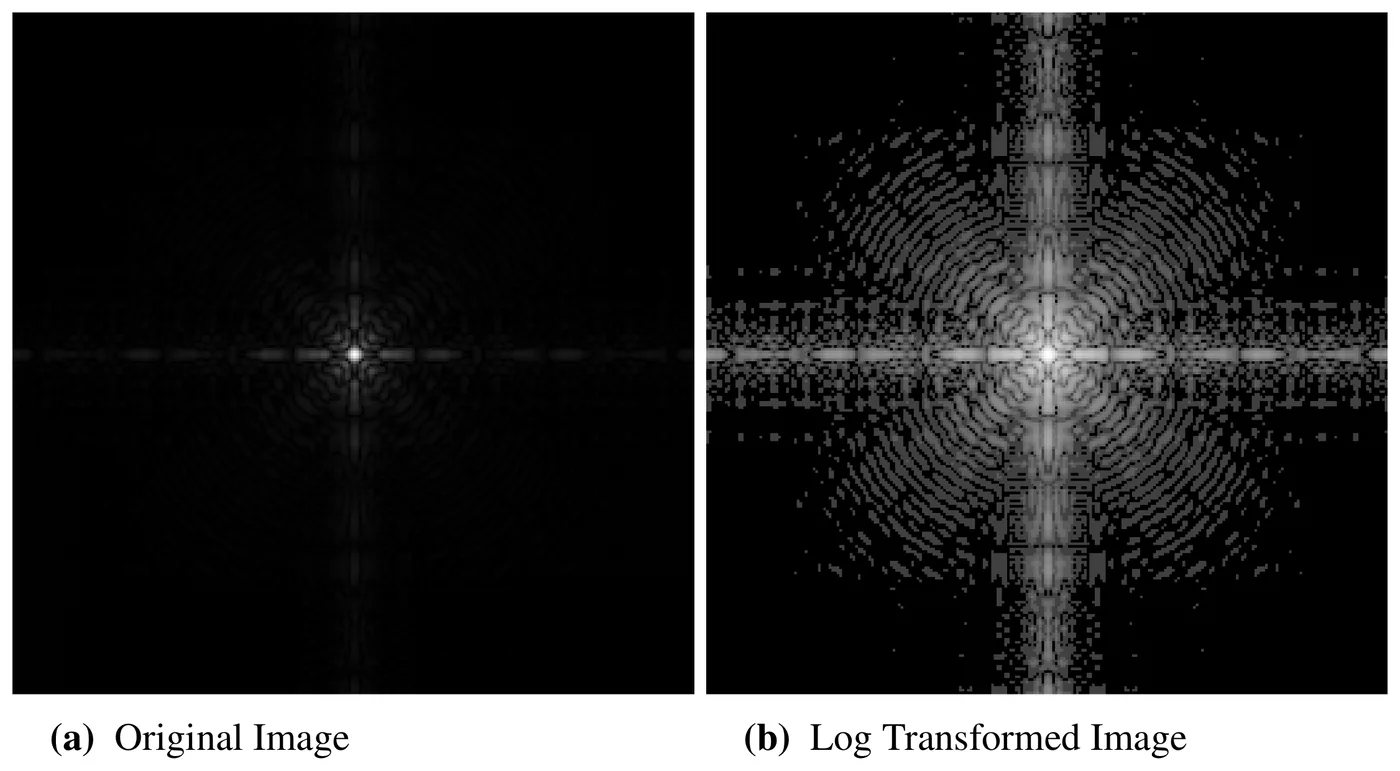
Figure 8 from the report (p. 9): a DFT magnitude spectrum before and after log_transform.
This is the log transform’s actual sales pitch. Original image credited to Gonzalez &
Woods, Digital Image Processing (3rd ed.).
The exact call that produced it is
log_transform(fig0305_a_dft, 1, base=10.0): c = 1, base-10 log, default prescale = 1.0. I mention the constant only to flag that it is not meaningful outside this context:
a raw DFT magnitude array can be enormous (millions, for a busy image), so c = 1 on
base-10 log still compresses it down to a sane range. Feed that same c = 1 to an 8-bit
grey level and log10(1 + 255) ≈ 2.4: the output image would be almost entirely black.
The widget below works on ordinary 0–255 photographs, so its log mode picks so
that instead, the curve Figure 7 actually plots, not the constant
this specific driver call used.
Gamma: one knob from crush to lift
The function that computes it:
def gamma_transform(src, c, gamma):
    out = c*src**gamma
    #return cv2.convertScaleAbs(out)
    return out
One parameter, and it spans everything from “crush the shadows to black” () to the identity () to “lift the shadows, compress the highlights” (). The report frames this as the fix for old CRT monitors, whose electron guns responded to input voltage non-linearly (roughly ): measure that exponent and pre-correct the image with its reciprocal, and the round trip becomes the identity again. That’s also where the name comes from: this is the gamma correction.
The report’s own driver applies it to two demo images at the report’s own exact values:
fig0308_a_gamma_0_6 = gamma_transform(fig0308_a_fractured_spine, 1, 0.6)
fig0308_a_gamma_0_4 = gamma_transform(fig0308_a_fractured_spine, 1, 0.4)
fig0308_a_gamma_0_3 = gamma_transform(fig0308_a_fractured_spine, 1, 0.3)
...
fig0309_gamma_3 = gamma_transform(fig0309_a_arial, 1, 3.0)
fig0309_gamma_4 = gamma_transform(fig0309_a_arial, 1, 4.0)
fig0309_gamma_5 = gamma_transform(fig0309_a_arial, 1, 5.0)lifts a near-black spine MRI into something readable; crushes a washed-out aerial photograph back into contrast. Figure 9 plots the whole family the report tried, from up to : nine curves fanning out from the diagonal identity line, all meeting at and .
Contrast stretching: three line segments, and you can draw them yourself
Log and gamma are both continuous, one-parameter curves. The report’s next trick drops the
“continuous” part: a piecewise-linear function through three straight segments, from
to , then to ,
then to . Here’s the function that builds exactly that, using
np.interp, a piecewise-linear interpolator given four control points:
def contrast_stretching(src, p0, p1, L=256):
    out = np.interp(src, [0, p0[0], p1[0], L-1], [0, p0[1], p1[1], L-1])
    #return cv2.convertScaleAbs(out)
    return out
Set and to an image’s own min and max and , , and this
stretches whatever narrow band of grey levels the image actually uses across the full
range: a full-contrast linear normalisation, and it’s exactly what the driver does for the
low-contrast pollen photo: contrast_stretching(pollen, (min, 0), (max, 255)). Set
instead (a zero-width middle segment, a vertical jump from to ) and
the “stretch” becomes a hard threshold; the driver does that too, at .
This is also the widget’s best interaction, so here it is: three panels, always linked. The image on the left is the current transform’s output, with a divider you can drag (or the slider under it) back to the untouched original. The middle panel is the transfer curve itself: for contrast stretching, and are draggable handles directly on that plot, so dragging is editing Eq. 4.3’s segments, and the image updates as you move them. The right panel is the input histogram behind the output histogram, with the output’s cumulative distribution overlaid: more on why that line matters once we get to equalisation.
With JavaScript on, this becomes LUT Lab: an image panel, a transfer-curve panel with draggable handles, and a histogram/CDF panel, all linked. Switch between log, gamma, contrast stretch, intensity slicing, bit planes, global histogram equalisation and CLAHE from the mode selector; each mode has a “reset to the report’s values” button. Upload your own photo, paste one, drag one in, or use your camera.
Intensity-level slicing: keep a band, drop or dim the rest
A narrower version of the same idea: instead of stretching a range of levels, highlight just one band and either discard everything else or leave it dimmed underneath. Here are the two variants:
def intensity_level_slicing_two_tones(src, grey_range, off_value=0, on_value=255):
    out_img = np.ones(src.shape, src.dtype)*off_value
    on_indc = np.where((src.flat > grey_range[0]) & (src.flat <= grey_range[1]))
    out_img.flat[on_indc] = on_value
    return out_img


def intensity_level_slicing_scaled(src, grey_range, scale=1.0, on_value=255):
    out_img = src*scale
    on_indc = np.where((src.flat > grey_range[0]) & (src.flat <= grey_range[1]))
    out_img.flat[on_indc] = on_value
    #return cv2.convertScaleAbs(out_img)
    return out_img
Both are still one array in disguise: for a fixed grey_range, off_value/on_value (or
scale/on_value), the output for a given input level never changes, so lut[v] = (lo < v <= hi) ? on : off (two-tone) or lut[v] = (lo < v <= hi) ? on : v * scale (preserving
the background) covers both. The report runs this on a kidney CT angiogram, isolating the
bright contrast-agent-filled vessels at levels 150–255: (150, 255), 50, 200 for two-tone
and (150, 255), 0.6, 180 for the preserving variant. That’s sample-kidney.png in the
widget’s sample picker, cropped from the same “Original Image” panel, switch the widget to
intensity-slice mode and “reset to the report’s values” reproduces both.
Bit-plane slicing: the cleverest four lines in the file
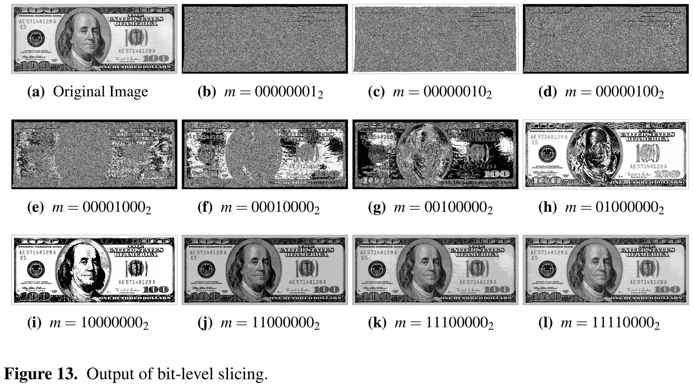
An 8-bit grey value is eight literal bits, and nothing stops you from masking off some of them. Keep only the most-significant bit and every pixel becomes 0 or 128, a rough silhouette. Keep only the least-significant bit and you get what looks like pure noise, because in a natural photograph the low bits barely correlate with anything a human eye would call structure. Three NumPy calls do this, and I still think it’s the nicest trick in the file:
def bit_level_slicing(src, mask):
    hold_img = src.copy()
    hold_img.shape += (1,)
    hold_img = np.unpackbits(hold_img, axis=2) * mask
    hold_img = np.packbits(hold_img, axis=2)
    hold_img.shape = hold_img.shape[:-1]
    return hold_img
unpackbits turns every uint8 pixel into eight literal 0/1 bytes along a new trailing
axis; multiplying by an 8-element mask (e.g. [0,0,0,0,1,0,0,0] to keep just one plane)
zeroes out every bit you don’t want; packbits folds the eight bytes back into one uint8.
Reshape off the extra axis and you’re back to an ordinary image, the whole operation
without a single explicit loop over pixels. And it’s still one LUT: for a fixed bit mask
, lut[v] = v & m, so keeping several planes at once (the report’s combined figures)
is just an OR of their individual masks.
Figure 13 from the report (p. 12): the report’s own bit-plane hero image. Panels (b)–(d) are the three least-significant planes, pure structured noise. Panels (i)–(l) add the most-significant plane, then the next, then the next, then the next: by four planes the bill is legible again. Original image credited to Gonzalez & Woods, Digital Image Processing (3rd ed.).
The report’s claim is that keeping only the top four planes “effectively halv[es] the size
of the image” while leaving it recognisable: four bits per pixel instead of eight, which
is a genuine 2× reduction if you actually re-pack to 4 bits per pixel (bit-plane slicing
alone doesn’t do that; it still stores a full byte per pixel with the low nibble zeroed,
which is why the widget’s “bytes saved” readout describes what you’d save by choosing to
store fewer bits, not what slicing gives you for free). The widget’s bit-plane mode has all
eight planes as checkboxes and a live readout of exactly that number; “reset to the report’s
values” checks the top four, reproducing panel (l) (m = 11110000₂) on
sample-dollar.png, the same $100 bill.
Histogram equalisation: the histogram is a PMF, its CDF is the LUT
Every transform so far is a curve you pick by hand. Histogram equalisation is the first one the image picks for you: treat the normalised histogram as a probability mass function over grey levels, and map each level to its own position in the cumulative distribution:
That’s Eq. 4.4 exactly as the report prints it, including, I’m fairly sure, an actual typo: the summation index is , but the summand is rather than . As written it’s not a running sum at all, just added to itself times. The intent (and what every implementation, including this one, actually computes) is the running sum , the CDF of the histogram.
Unlike every transform above, this one doesn’t implement the algorithm itself:
def global_hist_eq(src):
    return cv2.equalizeHist(src)


def block_hist_eq(src, tileSize=8, clipLimit=40.0):
    return cv2.createCLAHE(clipLimit=clipLimit, tileGridSize=(tileSize, tileSize)).apply(src)
Both functions are one-line wrappers around OpenCV. There’s no hand-rolled Python here to port for the widget: the Rust implementation below is my own, built from the documented behaviour of both algorithms, not a translation of code that already existed in this repo.
global_hist_eq’s CDF-as-LUT idea is straightforward to reproduce: build a 256-bin
histogram, walk it to a cumulative sum, scale to 0–255. The one wrinkle in
cv2.equalizeHist’s exact algorithm, which I matched rather than the naive version, is
that it skips forward to the first non-empty bin and treats that bin’s count as the new
zero, rather than starting the cumulative sum from level 0:
let mut i0 = 0usize;
while i0 < NBINS && hist[i0] == 0 { i0 += 1; }
let scale = 255.0f32 / (total - hist[i0]) as f32;
let mut sum: i64 = 0;
lut[i0] = 0;
for i in (i0 + 1)..NBINS {
    sum += hist[i] as i64;
    lut[i] = clamp_u8(sum as f32 * scale);
}
That single detail is why an image whose darkest pixel sits at, say, level 40 gets mapped all the way down to 0 rather than losing headroom to 40 empty bins nobody’s histogram occupies. Switch the widget to “equalise” mode and the transfer-curve panel draws this image’s own CDF live; watch the output histogram in the third panel flatten toward uniform, and its own CDF (the overlaid line) straighten toward the diagonal, which is the entire point of the transform stated as a picture instead of an equation.
Where global equalisation fails, and CLAHE
Equalisation works on the whole histogram, which is exactly its weakness: an image with one bright region and one dark region, each internally low-contrast, has a histogram with two separate clusters, and a single global CDF stretches the gaps between clusters more than it stretches detail within either one. The report’s Figure 15 makes this concrete with a synthetic test image, five faint shapes hidden inside otherwise-flat dark squares. Global equalisation reveals almost nothing but noise; splitting the image into tiles and equalising each one against its own local histogram reveals every shape.
That’s CLAHE, Contrast-Limited Adaptive Histogram Equalisation, and block_hist_eq’s
default is tileSize=8, clipLimit=40.0, which is also what produced Fig. 15(c). The sweep
the driver runs across the hidden-icon test image tries five more combinations:
(16, 40), (16, 80), (32, 160), (32, 255), (32, 20): all six are quick-preset
buttons in the widget’s CLAHE controls.
CLAHE has three moving parts, and my Rust implementation covers all three:
-
Per-tile histograms. Split the image into a
grid × gridarray of tiles (the last tile in each row/column absorbs any remainder pixels) and build a 256-bin histogram for each one independently. -
Clip and redistribute. A raw per-tile histogram can still have a huge peak (a flat sky occupies most of a tile), which would blow the contrast back out the way global equalisation does. Clip every bin at a limit (scaled by the tile’s own pixel count, the same way OpenCV scales
clipLimit) and spread the excess evenly back over all 256 bins, rather than discarding it:fn clip_histogram(hist: &[u32; NBINS], clip_limit: u32) -> [u32; NBINS] { let mut out = *hist; let mut clipped: i64 = 0; for b in out.iter_mut() { if *b > clip_limit { clipped += (*b - clip_limit) as i64; *b = clip_limit; } } let redist = (clipped / NBINS as i64) as u32; // ...spread the remainder over evenly-spaced bins, not the first few }Each tile then gets its own cumulative-sum LUT from its clipped histogram, exactly like global equalisation’s LUT but without the leading-empty-bin skip (a tile’s own histogram rarely has a long empty run the way a whole image’s can).
-
Bilinear interpolation between tiles. Apply each tile’s own LUT only inside its own tile and the tile boundaries would be visible as blocking artefacts: a pixel one row above a boundary and one row below it could jump several grey levels for no reason related to the image. Instead, every pixel is interpolated between the (up to) four nearest tile centres’ transforms, weighted by distance: a pixel near a tile’s own centre gets almost entirely that tile’s transform, a pixel between four tile centres blends all four.
Panel B, the transfer curve, has nothing to draw here: CLAHE doesn’t have one curve, it has one per tile, blended between them. In CLAHE mode the widget instead samples five tiles (the four corners and the centre of the current grid) and draws all five, which is really the whole point of this section rendered as a picture: five different curves, on the same image, all active in different places.
The point of building this in Rust
Log, gamma, contrast stretch, intensity slicing and bit planes are all one for loop over a
256-entry array, a few hundred microseconds even in plain JavaScript, comfortably fast
enough to run on every frame of a webcam feed, which is why none of the five above went
anywhere near WebAssembly. CLAHE can’t take that shortcut: it rebuilds a histogram-derived
LUT for every one of grid × grid tiles and then does a bilinear blend of up to four LUT
lookups per pixel, which is real, non-trivial per-pixel work rather than one array index.
The widget’s benchmark line (visible under the panels, it updates as you switch modes) is
computed live rather than quoted from a fixed run, but the shape of the result is
consistent: a LUT pass reliably lands in the hundreds of microseconds, CLAHE in the low
single-digit milliseconds at the same resolution: call it one to two orders of magnitude.
That gap is small enough that CLAHE is still comfortably interactive, and large enough that
it’s the one transform in this post where reaching for Rust and WebAssembly, rather than
another JavaScript loop, actually earns its keep.