Blog · Features and preprocessing ·
The frequency domain: aliasing, filtering before you downscale, and the convolution theorem
Halving an image can produce a pattern that was never in the scene. The fix is a circular mask on the DFT, and once you can paint on a spectrum, a lot of image processing stops being magic. With a Rust/WASM spectrum painter you can point at your own photos.
- interactive
- fourier
- fft
- aliasing
- sampling
- filtering
- rust
- wasm
Here is the fact that made section 6 of this report worth writing. Take a picture of a
checkerboard with sixteen-pixel squares. Shrink it to about a seventeenth of its size by
keeping every seventeenth pixel, which is, near enough, what a naive resize does. What
comes out is a checkerboard with finer squares than the one you started with.
Not a blurry version. Not a noisy version. A different, plausible, entirely fictional pattern, at a spatial frequency that does not exist anywhere in the original image.
The frequency domain is where that stops being spooky and becomes arithmetic.
An image is a pile of sinusoids
The report opens section 6 by saying that images, like every other discrete or continuous function, live in two places at once: the spatial domain, where a pixel is a brightness at a position, and the frequency domain, where the same picture is a sum of two-dimensional sinusoids, each with its own frequency, magnitude and phase. The Fourier transform moves between the two, and operations that are awkward on one side are often trivial on the other.
For a discrete image the transform is the DFT, and numpy hands it to you in one call. The
thing nobody warns you about is that you cannot look at the result. The DC coefficient
(the average brightness) is typically four or five orders of magnitude larger than anything
else, so a linear plot of is a black rectangle with one white pixel. The report
solves this the same way it solved it back in section 4 for the log intensity transform:
with an that exists purely so that a coefficient of exactly zero does not take the logarithm to and drag matplotlib’s autoscale down with it. In the code it is called, with no ceremony at all, the twiddle factor, defined the same way in both the spectrum-display script and the convolution-theorem script later in this post:
twiddle_factor = 10**-30and the display then clamps the bottom of the range by hand:
ax.imshow(20*np.log10(np.abs(fig4_36_d)+twiddle_factor), cmap='gray',
          interpolation='nearest', vmin=55)
That vmin=55 is a magic number, chosen by eye, and it is doing a lot of work: it throws
away everything below 55 dB so the structure that is left reads as structure rather than as
grey fog. The widget below exposes it as a slider, because watching a spectrum appear out of
the noise as you raise the floor is a better explanation than a paragraph.
Centring DC, and a trick I still like
The DFT puts zero frequency at index , which means the interesting low-frequency
content ends up smeared across all four corners of the plot. Everyone fixes this with
fftshift, which rolls each axis by half its length so DC lands in the middle.
There is a second way to do it, and the report’s Figure 23 shows it as a step in the
pipeline: multiply the image by before transforming. A shift by half the
sampling rate in one domain is a modulation in the other, and is exactly the
sample-by-sample value of a sinusoid at half the sampling frequency in both directions. So
that innocuous sign-flip is fftshift, done with multiplication instead of an index remap.
The code never spells it out; it just falls out of inverse-transforming a spectrum that has already been shifted:
fig4_36_b_fft = np.fft.fft2(fig4_36_b)
fig4_36_d = np.fft.fftshift(fig4_36_b_fft)
fig4_36_c = np.real(np.fft.ifft2(fig4_36_d))
fig4_36_c is panel (c) of the figure, and it is the padded image with every other pixel
negated: a checkerboard of the original. You can turn it on in the widget below.
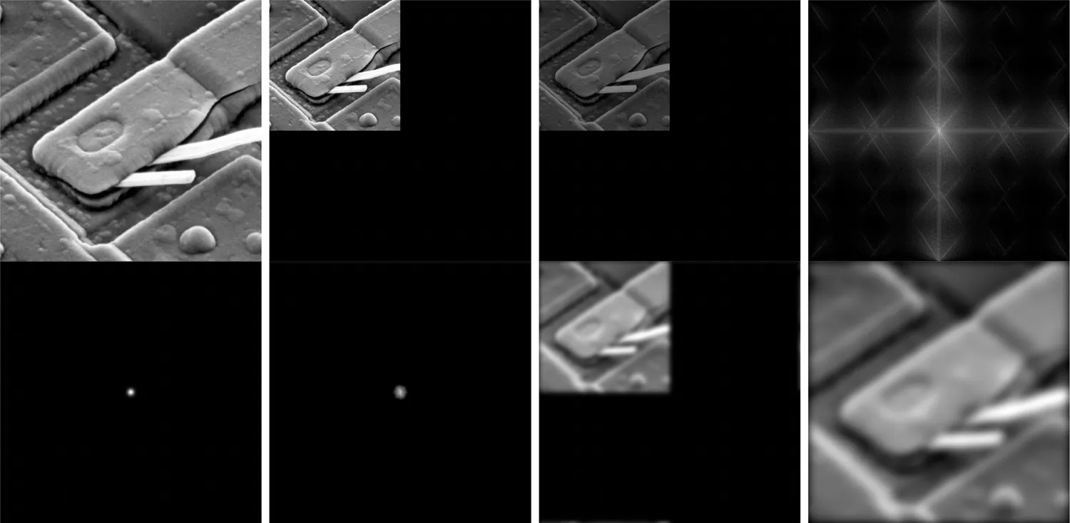
The report’s Figure 23, the whole recipe as a strip: original, zero-padded, ×(−1)^(x+y),
spectrum, Gaussian mask, masked spectrum, inverse, cropped. Source plate
Fig0431(d)(blown_ic_crop) from Gonzalez & Woods, Digital Image Processing 3rd edition,
reference [1] of the report, and the same picture the widget below ships as its
“Circuit” sample.
The rest of that pipeline is eight lines. Pad to twice the size on the bottom and right, transform, shift, build a Gaussian window, multiply, un-shift, invert, take the real part, crop back:
fig4_36_b = np.zeros(np.array(fig4_36_a.shape)*2)
fig4_36_b[:fig4_36_a.shape[0], :fig4_36_a.shape[1]] = fig4_36_a[:, :]

fig4_36_b_fft = np.fft.fft2(fig4_36_b)
fig4_36_d = np.fft.fftshift(fig4_36_b_fft)
fig4_36_c = np.real(np.fft.ifft2(fig4_36_d))

fig4_36_e = get_gaussian_window(fig4_36_d.shape[1], fig4_36_d.shape[0], 320)
fig4_36_f = fig4_36_d*fig4_36_e
fig4_36_g = np.real(np.fft.ifft2(np.fft.fftshift(fig4_36_f)))
fig4_36_h = fig4_36_g[:fig4_36_a.shape[0], :fig4_36_a.shape[1]]Paint on the spectrum
Everything above is setup for one interaction. The middle canvas is the log-magnitude spectrum with DC in the centre; erase part of it with the brush and the reconstruction on the right updates as you drag.
The thing to try first: turn on add a periodic pattern, look at the two bright dots that appear either side of the centre, then press Erase the brightest peak. The stripes vanish from the picture and nothing else changes. That pair of dots is the stripes. It is the most direct demonstration I know that the spectrum is not an abstraction. It is the picture, written down differently.
With JavaScript on, this becomes three linked canvases (a picture, its log-magnitude spectrum, and the reconstruction) and you can paint a mask directly onto the spectrum.
A few things worth doing in there:
- Keep only the middle (Ideal low-pass, small ) and watch the ringing. A hard-edged disc in frequency is a jinc function in space, and its sidelobes are those ripples around every edge. This is the entire motivation for the Butterworth filter further down.
- Erase only the middle (Ideal high-pass) and you get an edge map. Not a Sobel: the actual “everything that is not slowly varying” image.
- Turn on
×(−1)^(x+y)to see Figure 23(c) on your own picture. - Load the Circuit sample and drag the brush along the diagonal spokes. Those spokes are the etched tracks. Erasing them erases the tracks.
Painting a mask is not keyboard-operable, so every shape the brush can make is also available from the buttons and sliders above it, and Erase the brightest peak does the headline gesture in one click.
Nyquist, and why shrinking invents patterns
Now the part the section was actually about. The report puts it like this: aliasing happens when a function is sampled at less than twice the highest frequency present in it (the Nyquist rate), and once that has happened it is impossible to tell a high-frequency signal from a lower-frequency one. The high frequencies do not disappear. They fold down onto lower frequencies and sit there looking exactly like real image content.
Rescaling an image is resampling it. Shrinking is resampling at a lower rate. So shrinking an image that contains fine detail is the textbook way to cause aliasing, and the textbook fix is to throw the offending frequencies away before you resample, because afterwards there is no way to tell which is which.
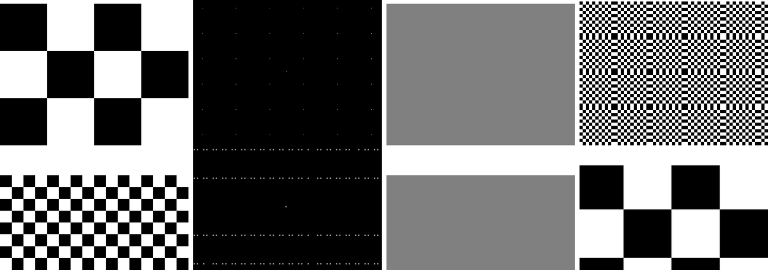
The report’s Figures 20 (top) and 21 (bottom), with the sub-captions dropped. Left to right in each row: a sample of the original, its DFT, the filtered-then-rescaled result, and the rescaled result with no filtering. Top row: 16-pixel squares, scaled by 0.0573. Bottom row: 6-pixel squares, scaled by 0.0800. The fourth panel in each row is the lie.
Look at the two rows carefully, because they fail differently. In the top row the sixteen-pixel checkerboard turns into a much finer checkerboard, which at least looks wrong. In the bottom row the six-pixel checkerboard turns into a coarse one that looks completely reasonable: you would ship it. The report’s own sentence is that Figure 21 shows the image “can appear to be normal even though it is invalid”, and that is the dangerous case.
The third panel of each row is the faithful answer at that sampling rate: flat grey. There is no representable checkerboard at 1/17th scale, so the correct band-limited answer is the average. A resampler that gives you a pattern is not being more helpful than one that gives you grey; it is making something up.
The recipe
The whole anti-aliasing procedure is nine lines:
def filter_image(img, scale_y, scale_x, window_type=create_window):
    img_fft = np.fft.fft2(img)
    img_fft_shifted = np.fft.fftshift(img_fft)
    window = window_type(img.shape, (img.shape[0] * scale_y, img.shape[1] * scale_x))

    img_filtered_fft_shifted = img_fft_shifted * window
    img_filtered_fft = np.fft.ifftshift(img_filtered_fft_shifted)
    ret_img_imag_real = np.fft.ifft2(img_filtered_fft)
    return (np.absolute(ret_img_imag_real),
            20*np.log(np.absolute(img_fft_shifted)))
The one line that carries the idea is the third. The window is img.shape * scale, so the
kept region of the spectrum is exactly as wide as the new sampling rate: half of it
either side of DC. Everything outside would have folded, so everything outside goes.
The driver makes that explicit, and it is a nice piece of bookkeeping:
fig416c = scale_image(fig416a, (0.9174/16, 0.9174/16))
fig416d = scale_image(fig416b, (0.4798/6, 0.4798/6))
...
fig416a_filtered, fig416a_fft = filter_image(fig416a, 0.0573375, 0.0573375)
fig416b_filtered, fig416b_fft = filter_image(fig416b, 0.07996666666666667, 0.07996666666666667)and . The filter fraction and the rescale factor are the same number, typed twice.
Also, quietly: the affine-transform helper’s scale_image function defaults to
nearest_interpolation, and the anti-aliasing script never overrides it. It imports
linear_interpolation and then never uses it. So every rescale in these figures is pure
nearest-neighbour decimation, which is precisely why the aliasing is so violent. That was
luck rather than judgement.
With JavaScript on, this becomes a downscale-factor slider with a pre-filter checkbox, the two results side by side, and their difference.
Tick and untick pre-filter before rescaling on the checkerboards and the fictional pattern flashes in and out. Then load the Zone plate (a pattern whose frequency rises linearly with radius, so a single picture contains every rate from DC to well past Nyquist) and drag the factor slider. The rings that appear in the unfiltered output are all alias. Then load the Circuit photo, where it is subtle but the difference panel is emphatically not zero.
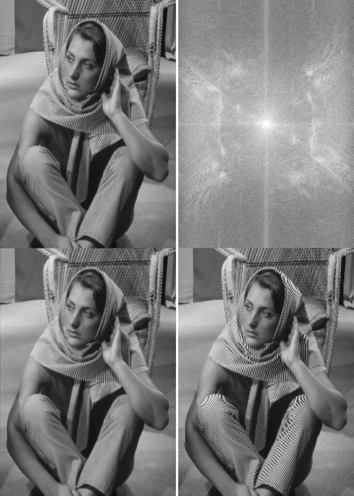
The report’s Figure 22, the canonical moiré. Top left the original; top right its DFT,
where the scarf and the trousers show up as those bright off-centre lobes; bottom left
filtered then rescaled; bottom right rescaled with no filter. The stripes in the bottom
right are not the stripes in the top left. Plate Fig0417(a)(barbara) from Gonzalez &
Woods, DIP3E.
That top-right panel is the reason the whole section exists. The stripes on the scarf are a narrow band of high frequency, sitting well out from the centre; drop the sampling rate and that band folds inward and lands on top of the low-frequency content, and you get a pattern that is neither the fabric nor the noise but a beat between them.
The convolution theorem, measured
The report notes it in one paragraph, almost in passing: multiplying in the frequency domain is convolution in the spatial domain. Convolution is what section 5 defined as Eq 5.1 except that the kernel is flipped about both axes first. So every spatial filter has an equivalent frequency-domain filter, and for a big enough kernel the frequency route is cheaper.
The demonstration is Figure 24, in the convolution-theorem script. Pad the image to twice
its size, pad the Sobel kernel out to the same size, transform both, multiply,
invert, crop, and compare against cv2.filter2D:
spacial_mask_padded = np.pad(spacial_mask,
                             ((0, fig0438_a_padded.shape[0]-spacial_mask.shape[0]),
                              (0, fig0438_a_padded.shape[1]-spacial_mask.shape[1])),
                             'constant')

fft_filter = np.fft.fft2(-spacial_mask_padded)
fft_filter_shifted = np.fft.fftshift(fft_filter)
...
fig0438_b_fft_filtered = fft_filter_shifted*fig0438_b
fig0438_b_filtered = np.real(np.fft.ifft2(fig0438_b_fft_filtered))[...]

fig0438_a_filtered = cv2.filter2D(fig0438_a, cv2.CV_64F, spacial_mask)
The report’s Figure 24. Left to right: the original, its DFT, the DFT of the x-oriented
Sobel operator, the result of filtering in the frequency domain, and the result of
filtering in the spatial domain. Plate Fig0438(a)(bld_600by600), Gonzalez & Woods, DIP3E.
The middle panel is the part people rarely see. A Sobel-x kernel, transformed, is two smooth lobes with a null down the vertical axis: it is a band-pass filter that ignores anything constant across . Written as three rows of small integers it looks like a rule of thumb. Written as a frequency response it is obviously a derivative: gain rising with , zero at .
That minus sign in front of the padded kernel above is not a typo. cv2.filter2D computes
correlation; the frequency product computes convolution, which is correlation with the
kernel rotated by 180°. For a
Sobel kernel that rotation is exactly a sign flip, so negating the kernel before transforming
is what makes the two routes agree.
With the placement corrected, the two agree to floating-point noise, and the bench below
prints the number rather than asking you to take the figure’s word for it. On the building
plate it reports a largest absolute difference of and a mean of
, against pixel values that run to : one part in three
million, which is f32 rounding accumulated across two 1024² transforms, not a
disagreement.
With JavaScript on, this runs the same Sobel through a 3 × 3 correlation and through a padded FFT and prints the largest difference between them.
The one caveat: the two domains only agree if they agree about the borders. A zero-padded
FFT computes a convolution with zeros outside the image, so the spatial reference here uses
zero borders too. cv2.filter2D defaults to BORDER_REFLECT_101, which differs, on the
one-pixel frame only, and by a lot.
Butterworth, because brick walls ring
The ideal disc from the anti-aliasing recipe is fine when you are about to throw the resolution away anyway. As a general-purpose filter it is bad, for the reason you can see in the Spectrum Painter: a hard edge in frequency means ringing in space.
The report’s answer is Eqs 6.1 and 6.2, a filter with a controllable roll-off order and a cutoff distance , where is the straight-line distance from to the centre of the spectrum:
At both are exactly for every ; as the low-pass becomes the ideal disc. In between you get a soft shoulder and no ringing. The implementation is four lines:
def lowpass_butterworth_filter(u, v, mu_u, mu_v, n, D_0):
    d_sq_uv = (((u-mu_u)**2+(v-mu_v)**2)/(D_0**2))**n
    return 1.0/(1+d_sq_uv)


def highpass_butterworth_filter(u, v, mu_u, mu_v, n, D_0):
    return 1.0-lowpass_butterworth_filter(u, v, mu_u, mu_v, n, D_0)
Note that the high-pass is written as rather than as Eq 6.2. Those are the same
function: divide numerator and denominator of through by and Eq
6.2 falls out. It is a small pleasure that the code and the report chose different but
equivalent forms of the same thing. There is a test asserting the identity to 1e-5.
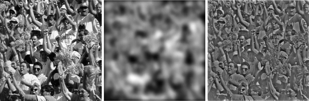
Part of the report’s Figure 25: a crowd, its Butterworth low-pass and its Butterworth
high-pass, both at , . Plate Fig0222(c)(crowd), Gonzalez & Woods, DIP3E.
looks aggressive because it is. The Butterworth script pads the image to twice its size before transforming, so is 20 pixels out of a half-width of a thousand or so, about two percent of the spectrum. That is the gotcha with : it is measured in bins of whatever transform you happen to have built, so the same number means different things at different image sizes and different padding. In the Spectrum Painter’s slider it is in pixels of an unpadded 512-wide spectrum, so there is a comparably brutal cut.
What the Rust does, and where it differs
The whole of this post’s interactivity is one Rust module, added to the imaging crate that
posts 45 and 46 already built out. rustfft does the one-dimensional transforms; the 2-D
transform is separable, so it is rows-then-columns, and the columns are gathered into a
scratch buffer because they are not contiguous.
The design decision that matters for the widget is that the forward transform runs once
per image load. The complex spectrum stays resident in WASM memory, already shifted, and a
brush stroke only rewrites the mask and runs the inverse. Re-transforming on every
pointermove would be four times the work for nothing.
It is worth about what you would hope. On this machine the inverse transform of a 512 × 512
spectrum takes 10–11 ms, and a full brush stroke (mask, inverse, and repainting all
three canvases) lands at 30–35 ms, which is why strokes are coalesced onto
requestAnimationFrame rather than run per pointer event. The convolution-theorem bench is
the expensive one at about 200 ms, because it builds a fresh 1024 × 1024 plan and runs
three transforms; it only fires when you change the picture or the operator.
Three places where my version is deliberately not the report’s:
| The Python | The Rust | |
|---|---|---|
| Sobel kernel placement | top-left corner, output shifted by (1, 1) | centre tap rolled to (0, 0) |
| Transform size | any size numpy likes | powers of two only |
| Spectrum for painting | zero-padded to 2× | unpadded, image cropped to fit |
The second is a size decision, not a maths one. rustfft’s planner supports every length via
mixed-radix, Bluestein and Rader, and compiling all of that added about 190 kB to the
.wasm. Instantiating Radix4 directly instead brought the crate back to 150 kB total,
at the cost of a power-of-two constraint that no part of this post minds. The third follows
from the second: rather than letterbox a photo into a square, the widget scales it to cover
and centre-crops. Zero-padding would have been more faithful to Figure 23, but padding smears
every spectrum peak into a sinc, and the whole point of the painter is that a periodic pattern
is two dots you can erase with a small brush.
The tests in the module are the ones I would want from anyone else’s FFT: a forward-inverse
round trip returns the input, a delta transforms to constant magnitude, Parseval holds
between the two domains, a low-passed constant image is unchanged, fftshift is its own
inverse at even sizes, Butterworth at large approaches the ideal disc, the two domains
agree on Sobel, and Figure 20’s window really does flatten a checkerboard while
nearest-neighbour decimation really does invent one (the test that actually caught a bug in
my own window code).
The thing I actually took away
Before this section I thought of the frequency domain as a place you visited to do a convolution faster. It is not. It is where the questions “what will survive being resampled”, “what does this filter actually do to my picture”, and “why is there a pattern in my image that is not in the world” all turn out to be the same question, with the same picture as the answer.
And it is where you learn that a resizing function which gives you a beautiful sharp downscale of a striped shirt is not being clever. It is lying, confidently, at 1/17th scale.